In order to easily work with Excel’s Chart Wizard, you’ll want to learn both how Excel views to-be-plotted data and the terminology that Excel uses to refer to the parts of a chart.
How Excel Sees Chart Data
To easily use Excel for charting, you need to learn three key terms: data points,data series, and data categories.
The individual values you plot in a chart are called data points. Because a chart visually represents one or more numeric values, data points are always values. Note, however, that most formula results are also numeric, which means that you can also plot formulas. (Actually, in this case, you’re really plotting the values that the formula calculates.)
The term data series refers to a collection of values that are all related—that are all part of the same set. That might sound complicated, but it’s really not. If you want to chart monthly interest rates over the last 10 years, that collection of interest-rate percentages is a data series. If you want to plot advertising expenditures over the last 12 months, that collection of expense values is a data series.
Most charts you create will use more than one data series. For example, if you wanted to compare sales revenues of three competitors, each competitor’s sales revenues would probably constitute its own data series. In the worksheet shown in Figure 3-1, you can see the annual sales revenues for three fictitious companies: Anderson Company, Baker Incorporated, and Carson Corporation. The data points that show Andersen’s revenue represent a data series. The data points that show Baker’s revenue represent another data. And the data points that represent Carson’s revenue represent still a third and final data series.

The term data categories refers to the secondary view, or perspective, on to-be-charted data. If you look at Figure 3-1 again, you can also see Year 1 data points, Year 2 data points, Year 3 data points, and so on. Each year’s collection of data points represents a data category. The collection of Year 1 data points represents the Year 1 data category. Similarly, the Year 2 data points represent the Year 2 data category. The same thing is true of the Year 3, Year 4, and Year 5 data points.
People commonly get confused about the differences between data series and data categories (in part because Microsoft’s product documentation typically hasn’t done a very good job of defining and distinguishing these two terms). You can use the following tips to help distinguish between data series and data categories in your own charts:
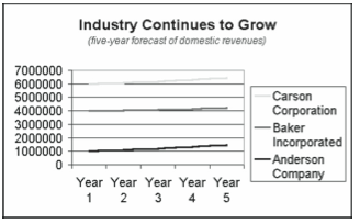
- In general, if you look at a chart and ask, “What does this chart show,” every concise answer identifies a data series. Figure 3-2 shows a simple line chart that plots the fictitious sales revenue from the worksheet shown in Figure 3-1. If someone asks you to describe what this chart shows, you’ll probably say something like, “Well, it shows Anderson’s revenue, Baker’s revenue, and Carson’s revenue.” Which is not a coincidence; charts show data series. Andersen’s revenue is a data series. And so is Baker’s revenue, and so is Carson’s revenue.
- Any chart that shows how some value changes over time is a time-series chart. In any time-series chart, the data categories will be some time interval, such as months or quarters or years. In Figure 3-2, for example, the chart plots sales revenue over a five-year period of time. Therefore, the chart is a time-series chart and uses time-interval data categories. In the case of Figure 3-2, the data categories are years.

Figure 3-2. A line chart of the sales revenue data shown in Figure 3-1.
Now that you understand the three terms data points, data series, and data categories, you need to know just two final details about the to-be-charted Excel data. First, and as Figure 3-1 shows, you want not only to provide the actual data point values, but you also want to enter labels that name the data series and the data categories. In Figure 3-1, for example, you can see that cells A2, A3, and A4 hold labels that describe the names of the companies. In cells B1, C1, D1, E1, and F1, you see labels that identify the time intervals used as the data categories. Including data category and data series names in your worksheet is important. If you include this information in your worksheet, it’s easily added later to your chart.
Second, note that Excel limits the number of data points and data series you can plot in a chart. A data series may hold no more than 4000 data points, for example. A chart may show no more than 255 data series. These constraints mean that you may sometimes need to arrange large data series or big sets of data series vertically by putting data series into worksheet columns rather than rows. Note that for smaller data series or small numbers of data series, a horizontal arrangement like that shown in Figure 3-1 works well.
Components of Excel Charts
Excel’s Chart Wizard and documentation use several charting terms: data markers,data-marker descriptions, legend, chart text, plot area, and chart area. You’ll find it useful to understand just what these words and phrases mean, so the bulleted list that follows provides definitions.
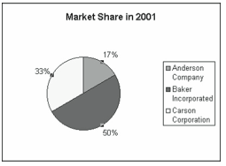
- Data markers are the graphical elements used to represent individual data point values in a chart. Figure 3-2, for example, uses symbols, or points, on a line to show data point values. Other types of charts in Excel use other data markers. A chart that uses columns or bars, for example, has column or bar data markers. A pie chart has pie-slice data markers (see Figure 3-3), and so on.

Figure 3-3. A simple pie chart. - Excel typically describes and qualifies data markers using the data-marker descriptions such as axis scales and data labels. Different types of charts use different data-marker descriptions. Bar, column, and line charts use axis scales. (This is what Figure 3-2 shows, of course.) Pie and doughnut charts use data labels (see Figure 3-3).
- A legend names and identifies the data series you’ve plotted. In Figure 3-3, the legend names the data series and then shows which colors are used for which pie slices.
- Chart text describes a chart or some part of a chart. Figure 3-2, for example, shows a chart title (Industry Continues to Grow) and subtitle (five-year forecast of domestic revenues). Figure 3-3 shows an example of a text box such as you might use to provide free-form annotation of a chart.
- The plot area of a chart is the area that includes the data markers and data-marker descriptions. In Figure 3-2, the rectangle that shows the lines and scales represents the plot area. In the chart shown in Figure 3-3, the circle that shows the slices of pie and the data labels that identify the slices of pie comprise the plot area.
- The chart area includes plot area, any chart text, and a legend.
Leave a Reply