Excel includes a useful tool for mapping geographic data. The Microsoft Map tool that comes with Excel (but often isn’t installed until you first attempt to use it) makes to easy create charts that show data using maps.
Adding the Map Button to the Toolbar
To quickly access the Data Map tool, you may want to add its button to the toolbar. To do so, follow these steps:
- Choose the Tools menu’s Customize command, and click the Commands tab.
When you do this, Excel displays the Customize dialog box. If the Commands tab doesn’t already show, click it so that the Categories and Commands list boxes, as shown in Figure 3-26, appear.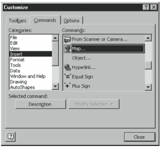
Figure 3-26. The Commands tab of the Customize dialog box. - Click the Insert item in the Categories list.
When you select the Insert item in the Categories list, Excel displays a list of the Insertion commands and toolbar buttons that can be added to menus and the toolbar. - Click the Map item in the Commands list.
Scroll down to see the Map item. Click the Description button to see a pop-up box that describes the selected command. - Drag the Map button to the toolbar, and then click the Close button.
Click the Map button and then, while holding down the mouse button, drag the Map button to an appropriate location on the toolbar. Because the Map button is another charting tool, for example, you may want to place it next to the Chart Wizard toolbar button.
Creating a Data Map
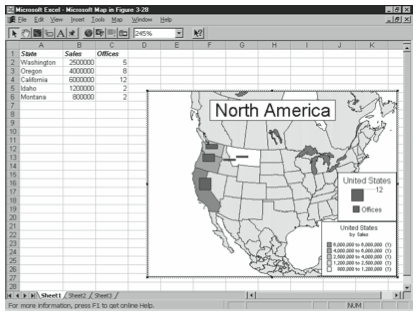
After you’ve installed the Microsoft Map tool, you’re ready to begin using it to geographically map data. To do this, enter your to-be-plotted data into a worksheet using either full (and correctly spelled) names or the generally accepted abbreviations. Figure 3-27 shows an example of how you might do this using fictitious sales by state.
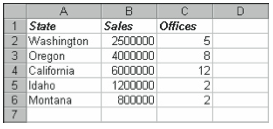
Map lets you plot by country, state, or postal code. However, Map needs you to arrange your data arranged in a columnar format, as shown in Figure 3-27. This means that the geographic feature names need to appear in the first column. Note, too, that these geographic feature names need to be text labels. This isn’t a problem for country or state names, but postal codes (which often use only numbers) can appear as values to Map—unless you precede each postal code with an apostrophe (’). The apostrophe character tells Excel to treat the value that follows, in this example, a postal code, as a label even though it looks like a value.
After you enter the to-be-plotted data into a worksheet, follow these steps:
- Select the worksheet data.
You can do this by clicking on the top left corner of the worksheet range and then dragging the mouse to the lower right corner. - Indicate where you want Excel to draw the map.
To identify the rectangle you want Excel to use as the data map’s chart area, drag the crosshair mouse pointer from the top left corner to the bottom right corner of the rectangle. - If necessary, choose the appropriate map for your geographic features.
If Microsoft Map has more than one map that matches the geographic features in your to-be-plotted data, it lists descriptions of the available maps and asks which you want to use. To select a map, double-click it.
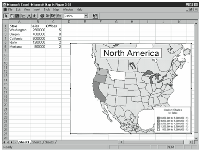
When you finish the last step, Excel draws the data map by interpreting the geographic features you’ve named in your to-be-plotted data. Figure 3-28 shows a data map based on the worksheet shown in Figure 3-27.
Customizing Your Data Maps
Microsoft Map provides three sets of tools you can use to change the appearance of your data maps: the Map menus (including its shortcut menus), the Map toolbar buttons, and the Map Control dialog box. This section briefly describes the Map toolbar buttons and the Map Control dialog box, and then lets you rely on your own experimentation to explore the Map menus (which essentially duplicate the functionality of the toolbar and Map Control dialog box). The Map toolbar provides several toolbar buttons, as detailed in Table 3-2 below.
| TOOL | DESCRIPTION |
| Select Objects | Tells Map that you want to select objects. To select objects after you click this toolbar button, click the objects (hold down the Ctrl key to select more than one object). Or, you can draw a rectangle that borders the objects you want to select by dragging the mouse from the top left corner to the bottom right corner of the rectangle. |
| Grabber | Tells Map that you want to move the map within the map’s window. To move objects after you click the Grabber tool, simply drag the item you want to move. |
| Center Map | Tells Map that the point you next click should be the map’s center point. To use this tool, click it and then click the center point you want. |
| Map Labels | Tells Map you want to add labels to the map. To use this tool, click it and then point to the geographic features you want to label, such as countries, lakes, states, and so on. If Map provides a label for the item you point to, Map displays the label. To place the label on your map, click the label. |
| Add Text | Tells Map you want to add text to the map. To use this tool, click it, click the spot where you want to add the text, and then type. |
| Custom Pin Map | Tells Map you want to add a push-pin icon to the next place you click on the map. After you click, Map lets you also add text by typing. |
| Display Entire Map | Resizes the map so it can be seen in entirety in the chart area. |
| Redraw Map | Redraws the map to minimize any stretching of geographic features, such as might occur after using the Grabber tool. |
| Map Refresh | Updates the map for changes in the data. |
| Show/Hide Microsoft Map Control | Opens the Microsoft Map Control window, which provides additional tools for controlling the appearance of your data map. |
| Zoom Percentage of Map | Resizes the map object to some percentage of its original size. Note that you indirectly change the level of detail shown in the map when you resize it. |
| Help | Opens the Microsoft Map online Help file. |
The Microsoft Map Control dialog box provides additional toolbar buttons that you can use to customize your data map, including changing both the data it plots and the appearance it takes (see Figure 3-29).
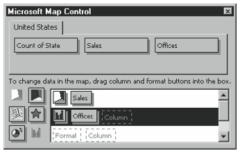
If you want to change the appearance of the data that Map initially plots, then you need to choose how you want each series formatted by using the formatting buttons in the Microsoft Map Control dialog box. Drag the Value Shading button to the Format box (in the white box) to use shades of gray. Drag the Category Shading button to the Format box (in the white box) to use color. Drag the Dot Density button to the Format box if you want to use patterns of dots, varying the density to show magnitude. Drag the Graduated Symbols button to the Format box to use a symbol, such as a bubble or star, of varying sizes to show magnitude. Drag the Pie Chart button to the Format box to use a pie chart. And, finally, drag the Column Chart button to the Format box to use a column chart. Figure 3-29 uses the Dot Density format for the sales data series and the Column Chart format for the offices data series.
After you’ve selected the formats you want to use, you assign data series to each format. To do this, drag the data series buttons shown on the top half of the dialog box to the Column buttons. In Figure 3-29, for example, you can see buttons for Count Of State, Sales, and Offices. To plot Offices using the Column Chart format, drag the Offices button to the Column box that’s just to the right of the format button. Figure 3-30 shows an example data map with sales indicated by dot density and offices shown in a column chart.
After you specify how each data series should be formatted and select your data, you can further customize each data series. To see your options, drag the Formatting option button to the white box and double-click it. Map displays a Format Properties dialog box that you can use for further customization. If you have a question about an option that appears on the Format Properties dialog box, click the Question button in the dialog box’s upper right corner and then click the item you have a question about.
Moving Beyond Simple Mapping
The brief discussion provided in this chapter may be all you need to know to use Microsoft Map, but readers who want to delve deeper into geographic mapping may find it useful to know three additional points:
- Excel comes with a workbook full of geographical data called mapstats.xls. You can find this workbook (you might have more than one if you’ve purchased more than one copy of Excel over the years) by using Microsoft Windows’ Start menu’s Find command. If you’re serious about data mapping, you’ll definitely want to find and review the mapstats.xls workbook because it provides a rich and very interesting (albeit somewhat dated) data set.
- Microsoft Office 2000 includes a stand-alone data mapping program called MapPoint 2000 that you can use to create more sophisticated data maps. MapPoint essentially extends the functionality of Map by adding maps, features, and geographic data.
- MapInfo, the company that developed the mapping technology used by Microsoft for Microsoft Map, sells high-end data mapping tools. If you’re interested in learning more about these products, visit the MapInfo web site at www.mapinfo.com.
Leave a Reply