Once you understand the terms that Excel uses to describe to-be-charted data and the parts of a chart, you can easily create charts. In essence, you need to simply select the worksheet data you want to chart, indicate where Excel should place the chart, and then tell the Chart Wizard to create the chart.
Using the Chart Wizard
To use the Chart Wizard, first enter your to-be-charted data in an Excel worksheet. As mentioned earlier, you want to include not only the data series data points but also the labels that identify the data series and the data categories. Figure 3-4 shows an example of how you might do this.

Once you have the data in a worksheet, follow these steps to create a chart that visually depicts the data:
- Select the data you want to plot in the chart.
To select the data, select the worksheet range that includes the data series and any data series names and data categories names. In Figure 3-4, you would select the worksheet range A1:G3. - Start the Chart Wizard.
You can do this by clicking the Chart Wizard button on the toolbar. Or you can choose the Insert menu’s Chart command. Excel displays the first Chart Wizard dialog box (see Figure 3-5).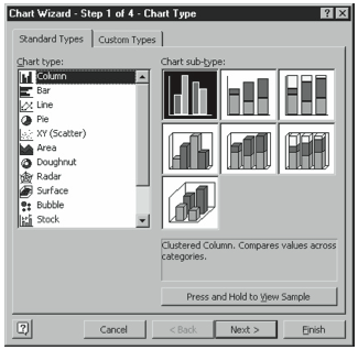
Figure 3-5. The first Chart Wizard dialog box. - Select the type of chart you want.
Select one of Excel’s chart types from the Chart Type list box. Excel provides 14 different types of charts: Column, Bar, Line, Pie, XY (Scatter), Area, Doughnut, Radar, Surface, Bubble, Stock, Cylinder, Cone, and Pyramid. - Select the Chart sub-type.
After you select the Chart type, Excel displays the different versions available for the chart type as clickable buttons in the Chart Sub-type box. Excel displays a short description of the selected chart sub-type in the area below the Chart Sub-type box. To select a chart, click the button that looks like the chart you want. After making your selection, click Next. - Verify that Excel has correctly interpreted the to-be-charted data.
When Excel displays the second Chart Wizard dialog box (see Figure 3-6), use it to verify that Excel is retrieving the correct data from the worksheet (this should be the case if you select the data correctly in step 1) and that it has correctly identified the data series. If Excel hasn’t correctly interpreted the to-be-plotted data, click the worksheet button at the right end of the Data Range text box. When Excel minimizes the Chart Wizard dialog box,reselectthecorrectrange.TorestoretheChartWizarddialogbox,clicktheworksheet button a second time. If Excel has misinterpreted how you’ve organized your worksheet data—Excel assumes the chart has fewer data series than data categories—click the other Series In option button. Click Next when you’re finished.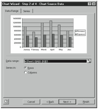
Figure 3-6. The second Chart Wizard dialog box. - Add chart text as needed.
When Excel displays the third Chart Wizard dialog box (see Figure 3-7), you use its Titles tab to add a chart title and axis titles. To add such chart text, just click the appropriate text box and type the text you want. Click Next when you’re finished.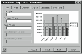
Figure 3-7. The second Chart Wizard dialog box. - Add chart text as needed.
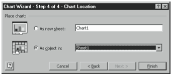
Excel lets you place charts either as free-floating graphical objects in a worksheet or on their own individual chart sheets. You use the fourth Chart Wizard dialog box (see Figure 3-8) to choose which location you want for your chart. To add a new sheet to the chart, click the As New Sheet option button and then enter a name for the new chart sheet. To add the chart as a free-floating object to an existing worksheet, click the As Object In option button and then select the worksheet from the As Object In drop-down list box. When you complete this step, you’ve finished creating the chart. Click Finish.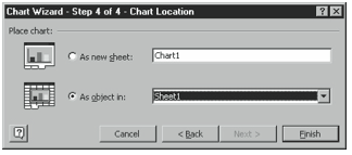
Figure 3-8. The fourth Chart Wizard dialog box.
Figure 3-9 shows how the worksheet data from Figure 3-4 looks in a column chart that resides on its own chart sheet. To view the chart, click its sheet tab. To print the chart in the selected sheet, simply click the Print toolbar button or choose the File menu’s Print command.
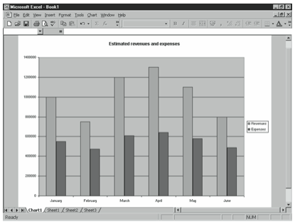
Figure 3-10 shows the same worksheet data as that shown in Figure 3-9, except this time the worksheet data is depicted in an area chart that’s free-floating as an object in a worksheet. You can resize any worksheet object, including a chart, by clicking the object and then dragging the square selection handles that appear on the sides and corners of the object.
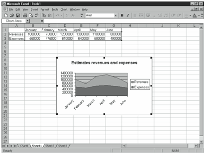
To print a free-floating chart object, click it and then click the Print toolbar button or choose the File menu’s Print command. You can also print the chart object by printing the worksheet over which it floats.
Choosing the Right Chart Type
Choosing the appropriate chart type is probably at least as much art as science. Nevertheless, it’s still worthwhile to briefly discuss the three issues that you’ll commonly want to consider as you choose a chart type: the basic data comparison that you want a chart to make, the principal message that you want a chart to communicate, and the relative strengths and weaknesses of the various chart types. All three factors greatly affect your choice of a chart type.
The Five Data Comparisons That Charts Make
Charts allow you to visually compare data in five basic ways, which means that your first step in determining the appropriate chart type is often simply to consider what data comparison you want to make. Suppose, for example, that you’ve collected detailed product sales revenue data for a golf equipment manufacturer. Using a chart, you might decide to look at this data in any of the ways summarized in Table 3-1.
| COMPARISON | DESCRIPTION |
| Part-to-whole | Compares an individual data point value to the sum of a data series. Comparing sales of a particular golf club set to total sales, for example, is a partto-whole comparison. |
| Whole-to-whole | Compares individual data point values to each other or data series to each other. Comparing sales of a starter men’s golf club set to a starter women’s golf club set, for example, is a whole-to-whole comparison. |
| Time-series | Compares data point values from different time periods to show how values change over time. Showing monthly sales over the last year, for example, is a time-series comparison. |
| Correlation | Compares different data series to explore correlation between the data series. Comparing industrywide sales to the average age of the population, for example, is a correlation comparison. |
| Time-series | Compares data values using a geographic map. Comparing sales by country, for example, is a geographic comparison. |
Once you decide what data comparison you want to make, it’s generally quite straightforward to identify the appropriate Excel chart types and sometimes even to identify appropriate chart sub-types.
- To make a part-to-whole comparison when working with just a single data series, you might choose a pie chart. (Pie charts plot only a single data series.) You might choose a doughnut chart or area chart if you’re working with more than one data series.
- To make a whole-to-whole comparison, you might choose a chart that uses horizontal data markers, such as a bar chart or one of the cylinder, cone, or pyramid chart sub-types that uses a vertical data category axis and data markers. You might also choose a doughnut chart or radar chart.
- To make a time-series comparison, you would typically choose a chart that uses vertical data markers, such as a column chart, a line chart, or one of the cylinder, cone, or pyramid chart sub-types that uses a horizontal data category axis and data markers. You might also choose the stock chart if you’re performing technical analysis of security prices. (Time-series charts typically use a horizontal data category axis because of the Western convention of using a horizontal axis to denote the passage of time.)
- To make a correlation comparison, you might choose the XY (scatter) chart if you’re working with two data series or the bubble chart if you’re working with three data series. You might also choose the surface chart if you want to explore trends in two dimensions.
- To make a geographic comparison, you would probably use Excel’s Data Map tool (described in the chapter section “Mapping Geographic Data”) or, possibly, the surface chart.
Importance of the Chart’s Essential Message
A second important factor to consider is exactly what message you want to visually communicate with your chart. Typically, you can use the message as the chart title. But beyond this, you may want to experiment with different chart types and sub-types to see which best support your message.
Strengths and Weaknesses of Different Chart Types
A third factor you’ll want to consider as you choose the best chart type is the relative strengths and weaknesses of each chart type. One could, of course, write an entire book on this subject. But you may find it useful to consider the strengths and weaknesses that people generally ascribe to the basic chart types as you choose a chart.
Area charts plot data point values using lines. Optimally, they stack the lines so they show cumulative data point values, and color the areas between the lines. Accordingly, area charts have two noteworthy strengths: They can show both the trend in the first data series and also the total of all the data series, and they can often create implicit total data series. Figure 3-11, for example, plots two data series: one for total expenses and one for profits. However, the total of these data series does not implicitly create a third data series for total revenues.
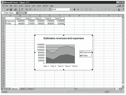
Area charts also suffer from several noteworthy weaknesses, however. They make it difficult to see the individual data point values (although this is a two-edged sword because the reduced emphasis on individual data point values also makes it possible to plot data series with large numbers of data point values). They make it next to impossible to compare data point values of the second and subsequent data series. (You can usually get a pretty good idea about the first data series data point values, though.)
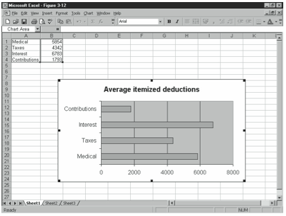
Bar charts plot data point values in individual bars but arrange the bars so you calibrate them using a horizontal values axis. Accordingly, bar charts work really well when you want to compare data point values in a whole-item to whole-item data comparison and when the data categories are not time periods. Another feature of a bar chart is that the horizontal orientation of the chart makes it possible to comfortably use more lengthy data series names, as shown in Figure 3-12. Bar charts suffer from one weakness in particular: because they show each data point value with its own data marker, as you increase the number of data points you’re plotting, the bars themselves become more narrow and less legible.
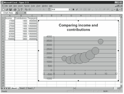
Bubble charts let you visually explore the relationships between data series by treating the horizontal axis as a second values axis. To accomplish this, bubble charts plot pairs of data points. In Figure 3-13, for example, the chart shows income and contribution and suggests, perhaps surprisingly, that as people make more money, they only modestly increase their charitable giving. Bubble charts differ from XY charts, which also show this same information, in that Excel sizes the bubbles using the values of a third data point. While initially confusing, a bubble chart lets you explore the relationships between two data series. (The only other Excel chart type that lets you do this is the XY [scatter] chart.) If the bubble chart suffers from a weakness, it is that the chart may suggest correlations or relationships that don’t exist.
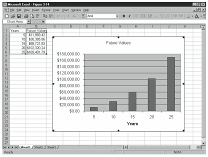
Column charts plot data point values in individual bars but arrange the bars so you calibrate them using a vertical values axis. Accordingly, column charts work really well when you want to view data point values in a whole-item to whole-item data comparison and when the data categories are time periods. Figure 3-14 shows a column chart that plots the future value of a retirement savings account based on $2,000-a-year contributions and a 9% annual return.
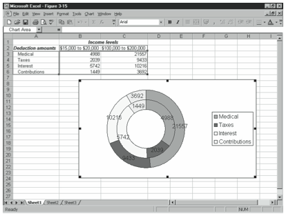
Doughnut charts work similar to pie charts, plotting data series in concentric rings and showing each data point value as a segment, or bite, of the ring. Compared to pie charts, doughnut charts possess an advantage: they allow you to plot more than one data series. As a practical matter, they suffer from the same weaknesses as pie charts: they don’t let you compare data point values between series (even though they paradoxically show multiple data series). They also limit you to small data sets. Almost always, something that appears in a doughnut chart should instead be shown with some other chart type. Figure 3-15, for example, compares the average deduction of taxpayers with $15,000 to $20,000 of adjusted gross income (shown with the inner doughnut) with those taxpayers with $100,000 to $200,000 of adjusted gross income (shown with the outer doughnut).
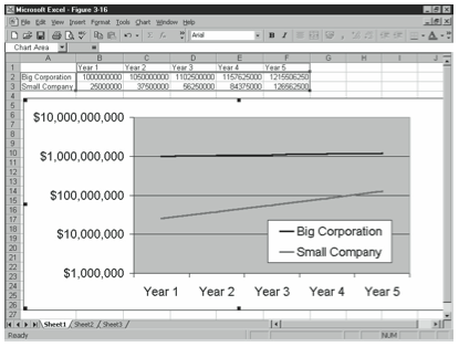
Line charts generally plot individual data points in a line, using either different data marker symbols or different colored lines to distinguish the data series, and using a horizontal data category axis. Because line charts de-emphasize individual data point values, they work well for large data sets. With a line chart, you can literally plot thousands of data points. What’s more, of all the Excel chart types, line charts tend to emphasize changes and trends in the data point values, which can be useful. Figure 3-16, for example, uses a logarithmic values axis, which means that it lets the viewer compare the rates of growth of a large company growing at 5% annually with a small company growing at 50% annually. Predictably, however, line charts suffer from some weaknesses: a de-emphasis of individual data point values which can camouflage inappropriately small data sets and make it impossible to compare individual data points, a tendency to show time-based trends that don’t exist, and a tendency to show relationships between data series that don’t exist.
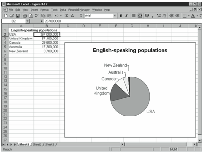
Pie charts, as almost everybody knows, show a single data series and depict individual data points as segments of the circle, or slices of the pie. While this means that they allow people to compare individual data point values to the total of all the data point values—and one might argue this is a strength—in general, pie charts are without merit because they can show only a single small data series. Almost always, something that appears in a pie chart should instead be shown in a table. Figure 3-17, for example, uses both a table and a pie chart to show the same data set: populations of major English-speaking countries. You’ll probably agree that the table shown in the worksheet range A1:B6 works much better as a communication tool than the pie chart.
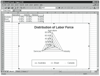
Radar charts plot each data category’s data point values on separate value axes and connect the data point values of each data series with a line (see Figure 3-18). The strength of a radar chart is that it may make it possible to precisely compare individual data point values within a data category. The weakness of a radar chart is that it may make it difficult for you to compare data point values in different categories (although this isn’t always a problem). You’re also practically limited to a small set of data categories because the chart uses a separate value axis for each. (You obviously can’t, for example, plot a set of data with 200 categories.)
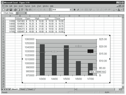
Stock charts plot security prices in a common open-high-low-close format (see Figure 3-19). Note that if you do choose to create a stock chart, Excel expects you to organize your data series in this order: volume, opening price, high price, low price, and closing price, as shown in Figure 3-19.
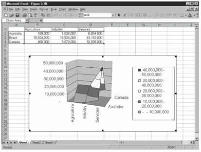
Surface charts plot data series in a three-dimensional grid, generally using color not to identify data series but rather to indicate value axis ranges. The principal strength of a surface chart is that it lets you show with equal emphasis both relationships within a data series and within a data category. A surface chart, however, also suffers from two weaknesses: One, because the chart does show a three-dimensional surface, it’s easy for the topography of the plot area to hide data—for peaks to hide valleys. Two, although the surface uses color in its value calibrations, there really isn’t any agreed upon order to colors. Is the color red “greater” than blue, for example? Is yellow “less than” green? Figure 3-20 shows a surface chart that plots labor force distribution data for Australia, Brazil, and Canada.
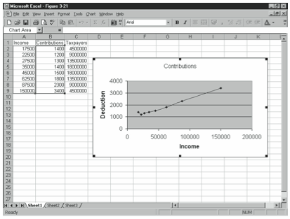
XY (Scatter) charts let you visually explore the relationships between data series by treating the horizontal axis as a second values axis. To accomplish this, XY charts actually plot pairs of data points. In Figure 3-21, for example, the chart shows U.S. Internal Revenue Service data on income and charitable contributions. The huge strength of an XY chart is that it lets you explore the relationships—perhaps causation or simply correlation—between two data series. The XY chart is the only Excel chart type that lets you do this. If the XY chart suffers from a weakness, it is that the chart may suggest correlations or relationships that don’t exist. (You can use Excel’s regression analysis tools, discussed in Chapter 4, to examine whether two data series appear correlated.)
Customizing Your Charts
You can easily customize your charts so they better fit your needs. You can, for example, rerun the Chart Wizard. This approach is usually simplest. But you can also use Chart menu commands to change specific elements of a chart. The paragraphs that follow discuss each of the two approaches because you’ll find occasion to use both.
Using the Chart Wizard to Customize a Chart
To use the Chart Wizard to customize a chart, select the chart and then click the Chart Wizard toolbar button. Excel restarts the Chart Wizard, and you can step through the four dialog boxes (described earlier in this chapter) to make your changes.
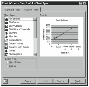
Note that you can make changes not described in the earlier discussion of the Chart Wizard, too. Figure 3-22, for example, shows the Custom Types tab of the first Chart Wizard dialog box. The Custom Types tab displays a variety of hybrid charts in which different data series use different data markers and also charts that use unusual color schemes. To use one of these custom chart types, select it from the list.
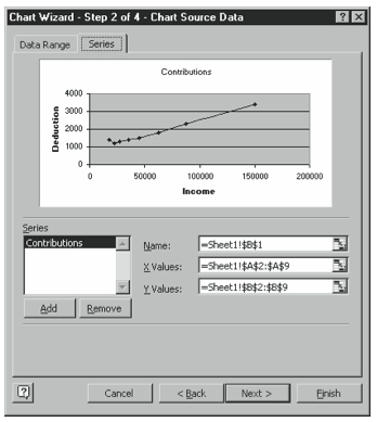
You can add to or change the data series plotted in a chart using the Series tab of the secondChartWizarddialogbox,whichisshowninFigure3-23.Tochangeadataseries,click its name in the Series list box and then change the values in the Name and Values boxes. To add a data series to the chart, click Add, and then, after Excel adds the new series, use the Name and Values boxes to name the data series and identify the worksheet range holding the data series. To remove a data series, click the data series and then click Remove. Note, too, that the Series tab also provides a box you use to specify which worksheet range holds the data category names.
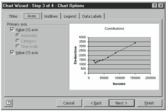
You can use the third Chart Wizard dialog box, shown in Figure 3-24, to change the text you’ve used to annotate the change, the appearance of the chart’s axes, the gridlines used within the plot area, the location of a legend (and whether you even want one of these), whether data labels appear next to data markers, and whether a table of the plotted data also appears in the chart. Figure 3-24, for example, shows the Axes tab. You use its check boxes to indicate whether you want a category and value axis and, for the category axis, what formatting you want. Rather than reading about what each of these options does, experiment with them yourself. If your experimentation still leaves you with questions, click the Question button in the dialog box’s upper right corner and then click the option you have a question about.
This book doesn’t show pictures of the other tabs. You can easily see them yourself by clicking the appropriate tab. Note, however, what each of the other tabs allows you to do. The Gridlines tab displays check boxes you can select to add horizontal and vertical gridlines to plot the area of your chart. The Legend tab displays a Show Legend check box, which you can select to add a legend to the chart, and then Placement option buttons—Bottom, Corner, Top, Right, or Left—which you can use to indicate where you want the legend placed. The Data Labels tab displays a set of option buttons you can use to indicate whether you want the actual data point values or equivalent percentages written next to their data markers. Finally, the Data Table tab, if it appears, provides two check boxes, which you can select to add a table and, optionally, a legend of the data point values to the bottom of the chart area.
You can use the fourth Chart Wizard dialog box, shown in Figure 3-25, to relocate a chart. To do this, simply select the other option button when you see this dialog box. For example, if the dialog box initially shows the As New Sheet option button selected, select the As Object In option button—or vice versa.
Using the Shortcut Menu’s Format Command
While you can use the Chart Wizard or some of the equivalent Chart menu commands to customize a chart, Excel doesn’t allow you to make every change using just these methods. If you can’t use the Chart Wizard or an equivalent command to change some element of a chart, you can right-click the part of the chart that you want to change and then choose the Format command from the shortcut menu. For example, if you want to change the scaling of the values axis, you can right-click the values axis and then choose the Format Axis command. (Obviously, if you right-click other parts of a chart, Excel displays a different Format command which, in turn, displays a different dialog box.)
Some books on Excel spend pages describing the myriad changes you can make to each specific part of a chart. But you probably don’t really need that level of instruction. In a nutshell, you make only a handful of changes to each part of a chart:
- Patterns. Many of the Format dialog boxes display a Patterns tab that you can use to select the colors and lines you want Excel to use to draw the chart object.
- Fonts. Any Format dialog box for an element that includes text provides a Font tab that you can use to choose font, font style, font point size, and special text effects.
- Number. Any Format dialog box for an element that includes numbers provides a Number tab that you can use to choose a numeric formatting style.
- Alignment. Any Format dialog box for an element that includes text provides an Alignment tab that you can use to align text.
- Scale. The Format dialog box for both the axes and the gridlines provides a Scale tab that you can use to specify how Excel should calibrate and draw the axis or grid.
Leave a Reply