This section describes the statistical data analysis tools that come with the Analysis ToolPak. To install the Analysis ToolPak, choose the Tools menu’s Add-Ins command, select the Analysis ToolPak check box, and click OK. Excel may prompt you to insert the Microsoft Office 2000 or Excel 2000 CD if it isn’t currently in your CD-ROM drive.
Analysis of Variance (ANOVA)
Analysis of variance depends on three assumptions: that the observations are independent, that the response variable is normally distributed for each population, and that the variance of the response variable is the same for all of the populations.
You can use analysis of variance to test for the equality of k population means. To use the ANOVA tools, follow these steps:
- Choose the Tools menu’s Data Analysis command.
Excel displays the Data Analysis dialog box. - Select an ANOVA tool from the list.
Select the single-factor ANOVA tool to test the hypothesis that means from two or more samples drawn from populations with the same mean are equal. Select the two-factor with replication ANOVA tool if you want to include multiple samples for each group of data. Select the two factor without replication tool if you want to perform a two-factor ANOVA and include only one sample for each group of data. - Identify the data you want to analyze.
Enter the range of data you want to analyze in the Input Range box. - Describe how the data is organized.
If you’re performing a single-factor test, specify whether the data is in columns or rows.If you’re performing an ANOVA without replication, specify whether the input range includes labels.If you’re performing an ANOVA with replication, enter the number of rows contained in each sample in the Rows Per Sample box. Note that the number must be the same for all samples. - Enter a value for alpha.
Alpha gives the significance level related to the probability of rejecting a true hypothesis. - Specify where you want to place the ANOVA table.
Figure 4-15 shows an ANOVA table beneath production sample data from three plants.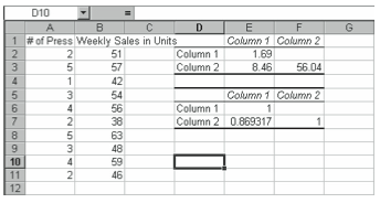
Figure 4-15. Testing analysis of variance of populations.
Correlation
You can use Excel’s Correlation tool to create a table of Correlation coefficient data. Like covariance, a correlation coefficient also measures the linear association between two variables, but unlike covariance, correlation coefficients take values between –1 and +1. Values near –1 indicate a strong negative linear relationship. Values near zero indicate lack or relationship, and values near +1 indicate a strong positive linear relationship. To use Excel’s Correlation tool on the PR Releases and Sales spreadsheet shown in Figure 4-16, follow these steps:
- Choose the Tools menu’s Data Analysis command.
Excel displays the Data Analysis dialog box. - Select Correlation from the list, and click OK.
Excel displays the Correlation dialog box. - Identify the data you want to analyze.
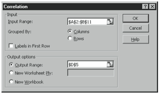
In the example, you would enter A2:B11 in the Input Range box. - Describe how the data is organized.
In the example, you would make sure the Columns option button is selected. - Use the Output Options to describe the location you want for the Correlation data table.
Click Output Range, and enter the upper left corner of the range where you want the data table to go. Alternately Click New Worksheet Ply to create a new worksheet in the current workbook for the data, or click New Workbook to create a new workbook for the data. The cell listed in Figure 4-17 shows where Excel places the data table when you click the Output Range option button and enter D5 in the box. - Click OK.
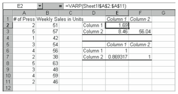
Figure 4-17. The Correlation dialog box. The value in cell E7 is the correlation coefficient between press releases and sales. Cells E6 and F7 both hold the value 1, as a variable is always perfectly correlated with itself.
Covariance
You use covariance to measure the linear association between two sets of data. A positive covariance indicates a positive relationship, meaning that larger values of one variable tend to correspond with larger values of the other. To use Excel’s Covariance tool on the PR Releases & Sales spreadsheet shown in Figure 4-18, follow these steps:
- Choose the Tools menu’s Data Analysis command.
Excel displays the Data Analysis dialog box. - Select Covariance from the list, and click OK.
Excel displays the Covariance dialog box. - Identify the data you want to analyze.
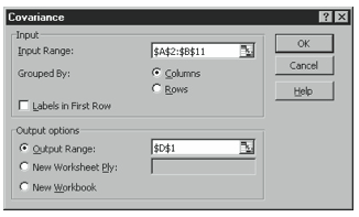
In the example, you would enter A2:B11 in the Input Range box. - Describe how the data is organized.
In the example, you would make sure the Columns option button is selected. - Use the Output Options to describe where you want the Covariance data table to go.
Click Output Range, and enter the upper left corner of the range where you want the data table to go. Alternately, click New Worksheet Ply to create a new worksheet in the current workbook for the data, or click New Workbook to create a new workbook for the data. Figure 4-19 shows where Excel places the data table when you click the Output Range option button and enter D1 in the box. - Click OK.
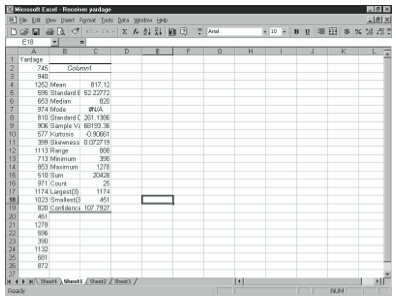
Figure 4-19. The Covariance dialog box. The value in cell E2 is the variance for the number of press releases and the value in cell F3 is the variance for sales. The value in cell E3 is the covariance between press releases and sales.
Descriptive Statistics
You can use the Descriptive Statistics tool to generate several descriptions measures for a data set at once. The Descriptive Statistics tool can find the mean, standard error, median, mode, standard deviation, sample variance, kurtosis, skewness, range minimum, maximum, sum, and count.
Figure 4-20 shows total yardage during a season for a sample of 25 NCAA college football receivers. To generate descriptive statistics for this data, follow these steps:
- Choose the Tools menu’s Data Analysis command.
Excel displays the Data Analysis dialog box.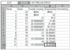
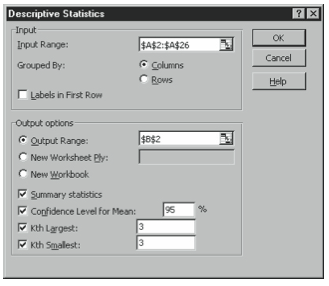
Figure 4-21. The Descriptive Statistics dialog box. - Enter A2:A26 in the Input Range box.
If you want to keep the Yardage label, enter A1:A26 in the Input Range box and select the Labels check box. - Describe how the data is organized.
In this example, you would click the Columns option button. - Use the Output Options to describe where you want the descriptive statistics table to go.
Click Output Range, and enter the upper left corner of the range where you want the data to go. Alternatively, click New Worksheet Ply to create a new worksheet in the current workbook for the descriptive statistics table, or click New Workbook to create a new workbook for the descriptive statistics table. - Select the Summary Statistics check box.
- Use the other check boxes to describe other statistics you want included in the descriptive statistics table.
If you have a small sample and want to find a confidence interval for the mean, select the Confidence Level check box and enter the confidence level in the text box. When Excel returns the Confidence Level value, you can say with the percent confidence you indicated that the population mean is plus or minus this amount from the sample mean. Select the Kth Largest or Kth Smallest check box, and enter a value k to have Excel include the kth largest or smallest data point in the table. For example, if you enter 3 in these two boxes, Excel lists the 3rd largest and 3rd smallest input values in the table. - Click OK.
If you have a small sample and want to find a confidence interval for the mean, select the Confidence Level check box and enter the confidence level in the text box. When Excel returns the Confidence Level value, you can say with the percent confidence you indicated that the population mean is plus or minus this amount from the sample mean. Select the Kth Largest or Kth Smallest check box, and enter a value k to have Excel include the kth largest or smallest data point in the table. For example, if you enter 3 in these two boxes, Excel lists the 3rd largest and 3rd smallest input values in the table.
Exponential Smoothing
You can use Excel’s Exponential Smoothing tool to develop forecasts using the exponential smoothing method. The exponential smoothing method uses the weighted average of previous series values to forecast the next period (meaning that recent data receives more weight than older data). With exponential smoothing, once you select a smoothing constant alpha, you do not need to include past data in the forecast computation. You need only the most recent observation. To use Excel’s Exponential Smoothing tool on the Sales spreadsheet shown in Figure 4-22, follow these steps:
- Choose the Tools menu’s Data Analysis command.
Excel displays the Data Analysis dialog box. - Enter A2:A26 in the Input Range box.
If you want to keep the Yardage label, enter A1:A26 in the Input Range box and select the Labels check box. - Select Exponential Smoothing from the list, and click OK.
Excel displays the Exponential Smoothing dialog box. - Identify the data you want to analyze.
In this example, you would enter B2:B11 in the Input Range box - Enter .3 in the Damping Factor box.
The Damping factor is equal to 1-alpha. - Describe where you want to place the smoothing forecast.
For example, if you enter D2 in the Output Range box, Excel places the smoothing forecasts in Column D.M - Click OK.
F-Test
You can use the F-Test tool to perform a two-sample F-test comparing two population variances. To do so, follow these steps:
- Choose the Tools menu’s Data Analysis command.
Excel displays the Data Analysis dialog box. - Select F-Test Two-Sample For Variances from the list, and click OK.
Excel displays the F-Test Two-Sample For Variances dialog box. - Enter the ranges of data you want to analyze in the Variable 1 Range and Variable 2 Range boxes.
- Specify whether the input ranges include labels.
- Enter the confidence level for the test, alpha.
Remember to express alpha as a decimal, and that it must be between 0 and 1. - Specify the location for the F-Test table, and click OK.
Use the Output Range option to place the table on the current worksheet, the New Worksheet Ply option to place the table on a new worksheet in the current workbook, or New Workbook option to create a new workbook for the table.
Fourier Analysis
This tool allows you to analyze complex periodic waveforms using the Fast Fourier Transform (FFT) method to transform data. A common use for Fourier Transforms is to characterize the behavior of share prices of a company on the stock market.
To use the Fourier Analysis tool, follow these steps:
- Choose the Tools menu’s Data Analysis command.
Excel displays the Data Analysis dialog box. - Select Fourier Analysis from the list, and click OK.
Excel displays the Fourier Analysis dialog box. - Enter the ranges of data you want to analyze in the Variable 1 Range and Variable 2 Range boxes.
- Specify whether the input ranges include labels.
- Specify the output location for the Fourier table.
Use the Output Range option to place the table on the current worksheet, the New Worksheet Ply option to place the table on a new worksheet in the current workbook, or New Workbook option to create a new workbook for the table. - Select the Inverse check box if the data in the input range is transformed and you want to find the original inputs.
- Click OK.
Histogram
A histogram is a common graphical presentation of frequency data. Using the file containing S&P 500 returns (refer to Figure 4-9), you can create a histogram by following these steps:
- Optionally, create bins holding a set of values in ascending order.
Excel will count the number of occurrences in the range that are equal to or less than the value you enter in the bin, and greater than the previous bin value. The more bins you create, the smaller the bars of your histogram. Excel creates an additional bin for all values greater than the highest bin value. - Choose the Tools menu’s Data Analysis command.
Excel displays the Data Analysis dialog box. - Select Histogram, and click OK.
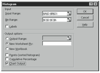
Excel displays the Histogram dialog box shown in Figure 4-23.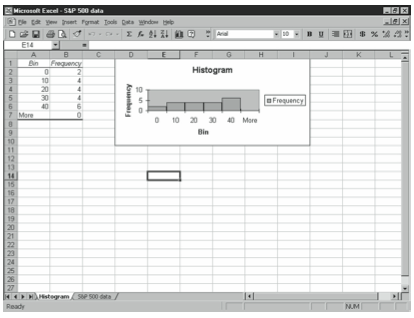
Figure 4-23. Creating a histogram. - Identify the data you want to analyze.
In this example, you would enter B2:B21 in the Input Range box. - Enter C2:C6 in the Bin Range box.
If you leave the bin range blank, Excel creates a set of evenly distributed bins between minimum and maximum values in your data set. - Use the Output Options to describe where you want the histogram and frequency distribution table to go.
Click Output Range, and enter the upper left corner of the range where you want the data to go. Alternatively, click New Worksheet Ply to create a new worksheet in the current workbook for the histogram, or click New Workbook to create a new workbook for the histogram. - Optionally, select the Cumulative Percentage check box.
This adds a cumulative percentage line to the histogram, and a cumulative percentage line to the frequency distribution table. - Select the Chart Output check box.
- Click OK.
Moving Averages
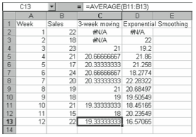
You can use Excel’s Moving Averages tool to develop forecasts using the moving averages method. The moving averages method uses the average of a certain number of the most recent values in the time series to forecast the next period. You can specify the number of most recent values you want to use. To use Excel’s Moving Averages tool on the Sales spreadsheet, shown in Figure 4-25, to produce a three-week moving average, follow these steps:
- Choose the Tools menu’s Data Analysis command.
Choose the Tools menu’s Data Analysis command. - Select Moving Averages from the list, and click OK.
Excel displays the Moving Averages dialog box. - Identify the data you want to analyze.
In this example, enter B2:B11 in the Input Range box. - Specify the number of data points you are using for each moving average in the Interval box.
In this case, enter 3 for three weeks. - Use the Output Options to describe where you want the moving averages table to go.
In this case, you could enter C2 in the Output Range box to put the moving average forecasts in column C. - Click OK.
Random Number Generation
Use the Random Number Generation tool to fill a range with random numbers following the distribution you specify. To use the Random Number Generation tool, follow these steps:
- Choose the Tools menu’s Data Analysis command.
Choose the Tools menu’s Data Analysis command. - Select Random Number Generation from the list, and click OK.
Excel displays the Random Number Generation dialog box. - In the Number Of Variables box, enter the number of columns you want Excel to fill with random numbers.
In this example, enter B2:B11 in the Input Range box. - In the Number Of Random Numbers box, enter the number of random numbers you want Excel to return.
- Select a distribution from the distribution drop-down list box.
Select Uniform if you want to specify a range within which the numbers are drawn with equal probability. Select normal for a normal (Gaussian) distribution. You can create a standard normal distribution by selecting Normal and entering for the parameters a mean of 0 and a standard deviation of 1. Select Bernoulli for a distribution with only two event classes, “success” or “failure.” Select Poisson to estimate the number of occurrences over a specified range of time or amount of space. Select patterned to specify a range within which numbers are repeated in a sequence. Select discrete if you have a set of values and another of their associated probabilities and want to generate numbers based on this information. - Enter the parameters for the distribution you selected.
- If you want to be able to produce the same set of random numbers at a later time, enter a value in the Random Seed text box.
Note this value for future use. - Specify the output location for random numbers, and click OK.
Rank and Percentile
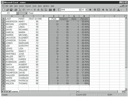
You can use the rank and percentile tool to create a table listing the rank, value, and percentile of data points in the data set. To do this, follow these steps:
- Choose the Tools menu’s Data Analysis command.
Choose the Tools menu’s Data Analysis command. - Select Rank And Percentile from the list, and click OK.
Excel displays the Rank And Percentile dialog box. - Identify the data you want to analyze.
Enter the range of data you want to analyze in the Input Range box. - Specify whether the values are organized in columns or rows.
- Specify whether the input ranges include labels.
- Specify the location for the Rank and Percentile table.
Click Output Range, and enter the upper left corner of the range where you want the table to go. Alternatively, click New Worksheet Ply to create a new worksheet in the current workbook for the table, or click New Workbook to create a new workbook for the table. - Click OK.
Figure 4-26 shows a rank and percentile table for a list of test scores in a class.
Regression
Toperformlinearregressionanalysis,youcanusetheRegressiontool.TheRegressiontool works by using the least squares method to fit a straight line through a set of x and y values. To use the Regression tool, follow these steps:
- Choose the Tools menu’s Data Analysis command.
Choose the Tools menu’s Data Analysis command. - Select Regression from the list, and click OK.
Excel displays the Regression dialog box. - Identify the data you want to analyze.
Enter the dependent variable range in the Input Y Range box and the independent variable range in the Input X Range box. - Specify whether the input ranges include labels.
- Optionally, select the Constant Is Zero check box.
Do this if you want to force the y-intercept constant (b) in the equation of the line (y=mx+b) to equal zero. - Optionally, select the Confidence Level check box.
Do this if you want Excel to define a range around your line which fits the specified percentage of data. - Specify the output location for the Regression table.
Click Output Range, and enter the upper left corner of the range where you want the table to go. Alternatively, click New Worksheet Ply to create a new worksheet in the current workbook for the table, or click New Workbook to create a new workbook for the table. - Use the Residuals options.
Specify whether you want to include standardized residuals in the output table, chart the independent variables against the residual, or chart expected values against the observed values. - Optionally, select the Normal Probability Plots.
Do this if you want Excel to chart normal probability. - Click OK.
Sampling
If you have population data and want to draw a sample from them, you can use Excel’s Sampling tool. To do so, follow these steps:
- Choose the Tools menu’s Data Analysis command.
Choose the Tools menu’s Data Analysis command. - Select Sampling from the list, and click OK.
Excel displays the Sampling dialog box. - Identify the data you want to analyze.
Enter the range of data you want to analyze in the Input Range box. - Specify whether the input ranges include labels.
- Describe whether you want a periodic or random sample.
Click the Periodic option button to sample every kth value and enter k in the Period box, or click the Random option button and enter the sample size you want in the Number Of Samples box. - Specify the output location for the sample values, and click OK.
Click Output Range, and enter the upper left corner of the range where you want the values to go. Alternatively, click New Worksheet Ply to create a new worksheet in the current workbook for the values, or click New Workbook to create a new workbook for the values.
T-Test
Use the t-Test tool to perform the Student’s t-test on a small sample. The t-test is commonly used to test for a difference between means.
- Choose the Tools menu’s Data Analysis command.
Excel displays the Data Analysis dialog box. - Select a t-Test option from the list, and click OK.
Select the Paired Two Sample For Means Test if you have a pairing of observations in the data sets, for example, if the data sets show values for the same sample before and after manipulation. The Paired Two Sample For Means Test does not assume that the variances of both populations are equal. Select the Two-Sample Assuming Equal Variances test if you assume the means of both data sets are equal. Select the Two-Sample Assuming Unequal Variances test if you assume that the variances of both data sets are unequal, for instance if the samples come from different populations. - Identify the data you want to analyze.
Enter the ranges of data you want to analyze in the Variable 1 Range and Variable 2 Range boxes. - Enter the hypothesized mean difference in the Hypothesized Mean Difference box.
- Specify whether the input ranges include labels.
- Specify alpha.
Enter .05 in the Alpha box for a 95% confidence level, .1 for a 90% confidence level, or .01 for a 99% confidence level. - Specify the output location for the T-Test table, and click OK.
Click Output Range, and enter the upper left corner of the range where you want the table to go. Alternatively, click New Worksheet Ply to create a new worksheet in the current workbook for the table, or click New Workbook to create a new workbook for the table.
Z-Test
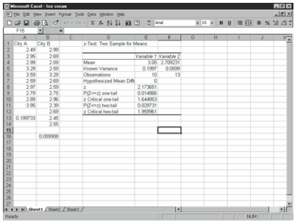
If you have a large sample and want to conduct a hypothesis test about the difference between two population means, you can use the z-Test tool. Before you can begin, you need to find the two sample variances. You can do this using the VAR function or using the Descriptive Statistics tool. Figure 4-27 shows an example worksheet with the prices of an ice cream sundae in several stores in two cities.
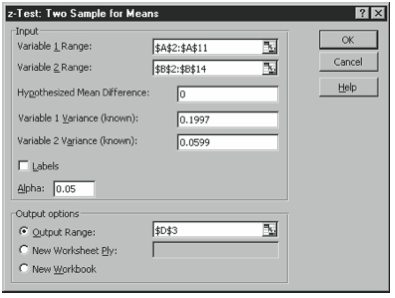
- Choose the Tools menu’s Data Analysis command.
Excel displays the Data Analysis dialog box. - Select z-Test: Two Sample For Means from the list, and click OK.
Excel displays the Sample For Means dialog box. - Specify the variable ranges.
In the example, enter A2:A11 in the Variable 1 Range box and B2:B14 in the Variable 2 Range box. - Enter 0 in the Hypothesized Mean Difference box.
This means that you are hypothesizing that the means are equal. Enter a different value if you are hypothesizing a difference between the means. - Specify the variance of the samples.
In the example, enter .1997 in the Variable 1 Variance box and .0599 in the Variable 2 Variance box. - Specify alpha.
Enter .05 in the Alpha box for a 95% confidence level, .1 for a 90% confidence level, or .01 for a 99% confidence level. - Use the Output Options to describe where you want the Correlation data table to go.
Click Output Range, and enter the upper left corner of the range where you want the data table to go. Click New Worksheet Ply to create a new worksheet in the current workbook for the data, or click New Workbook to create a new workbook for the data. - Click OK.
The value of z appears in the table. The two-tailed p-value also appears in the table. If this is less than alpha, reject the null hypothesis.
Leave a Reply